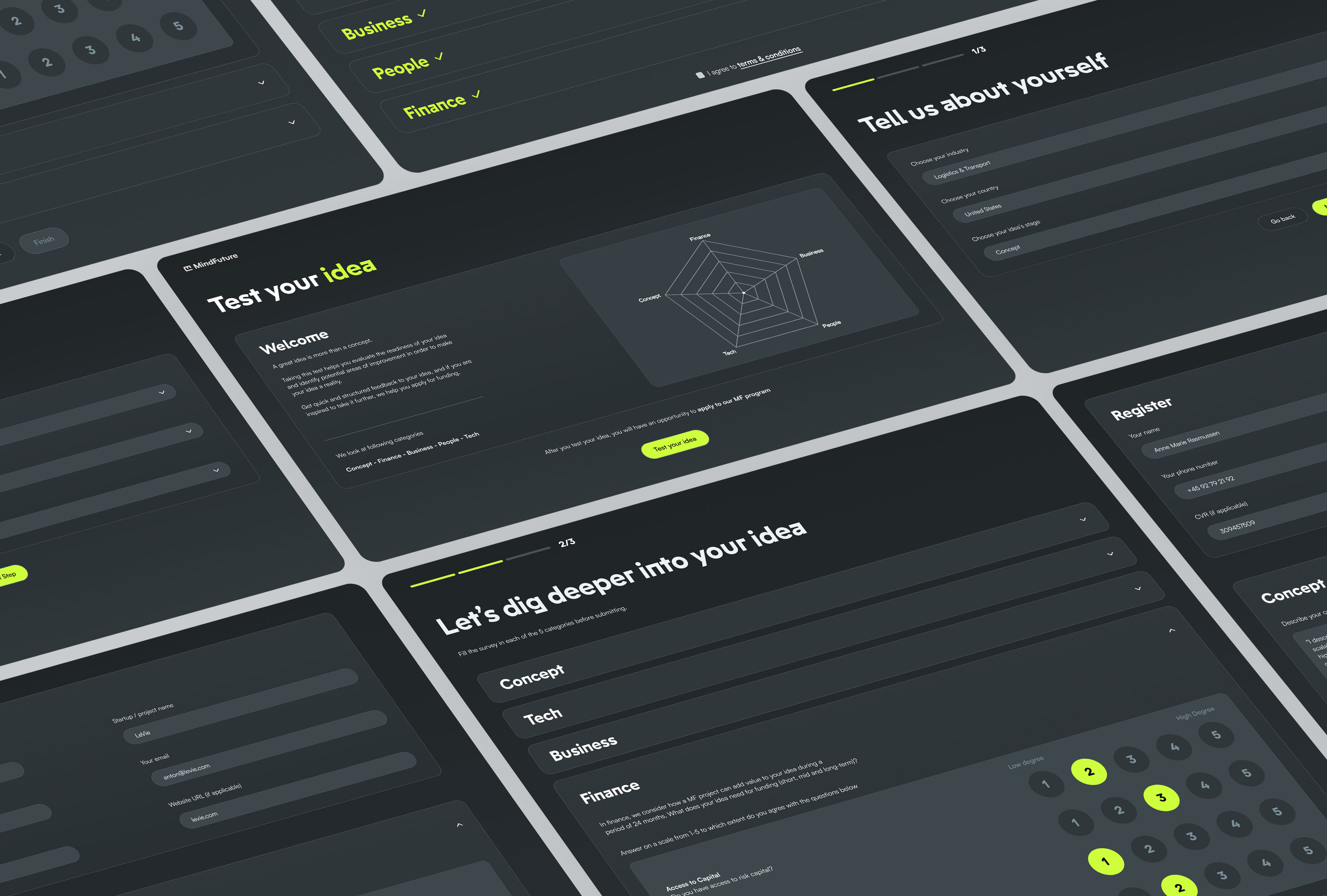
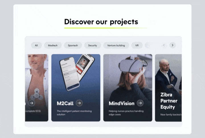
The platform guides founders through a structured five-category assessment (Concept, Tech, Business, People, Finance), collecting key startup data through targeted questions.
Onboarding: The welcome screen introduces the five-category assessment through a radar chart. Founders then share key context (industry, country, stage), allowing us to contextualize results.
Guided submission: Five collapsible sections group scale-based questions by category. Progress tracking and contextual prompts guide founders and support a clear, structured evaluation.
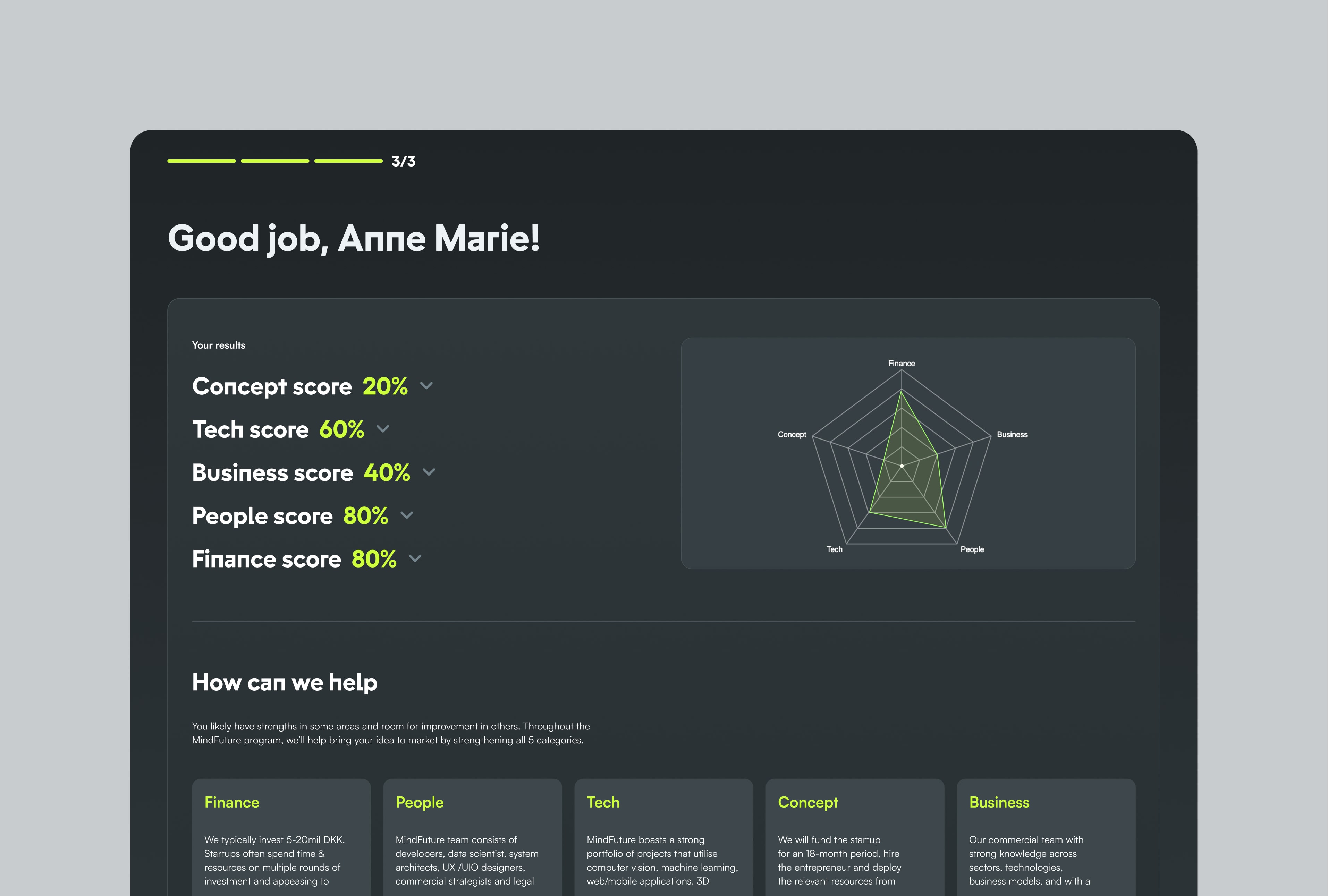
Results visualisation: Immediate scored feedback displays as percentages and a radar chart, making strengths and improvement areas instantly visible through visual category comparison.
Feedback delivery: Category-specific guidance highlights next steps and shows how MindFuture can support them. High-potential founders can proceed directly to the MF program using their assessment data.


.jpg)