Understanding the problem
Through conversations and workshops, I explored the daily challenges nurses and clinicians faced in intensive care. These conversations revealed the strain of continuous bedside presence, the risk of missing critical changes, and operational bottlenecks.
Defining phase
I mapped out pain points, different flows and journey maps to identify key moments and responsibilities. This research surfaced some critical insights that shaped the product strategy:
No control mechanisms for nurses' unavailability
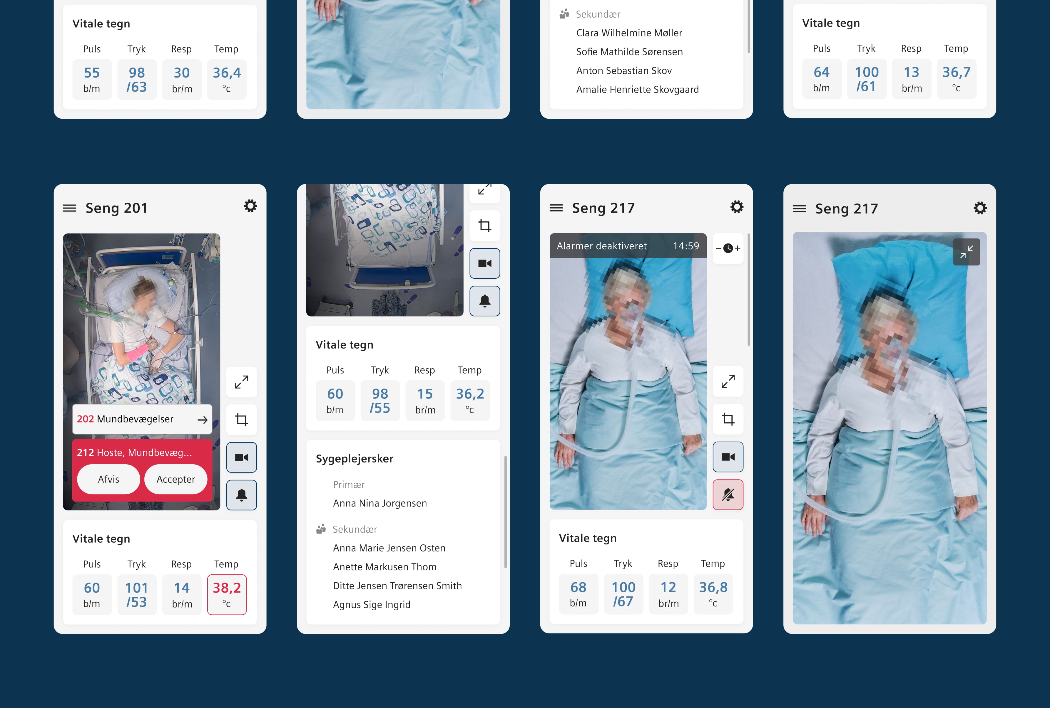
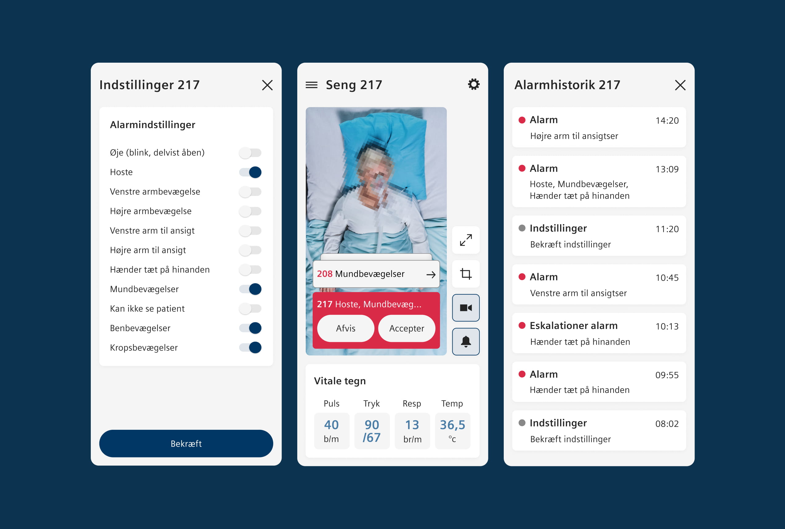
No overviews meant nurses lacked patient status visibility.
Trust issues with new tech, AI, workflows and reliability
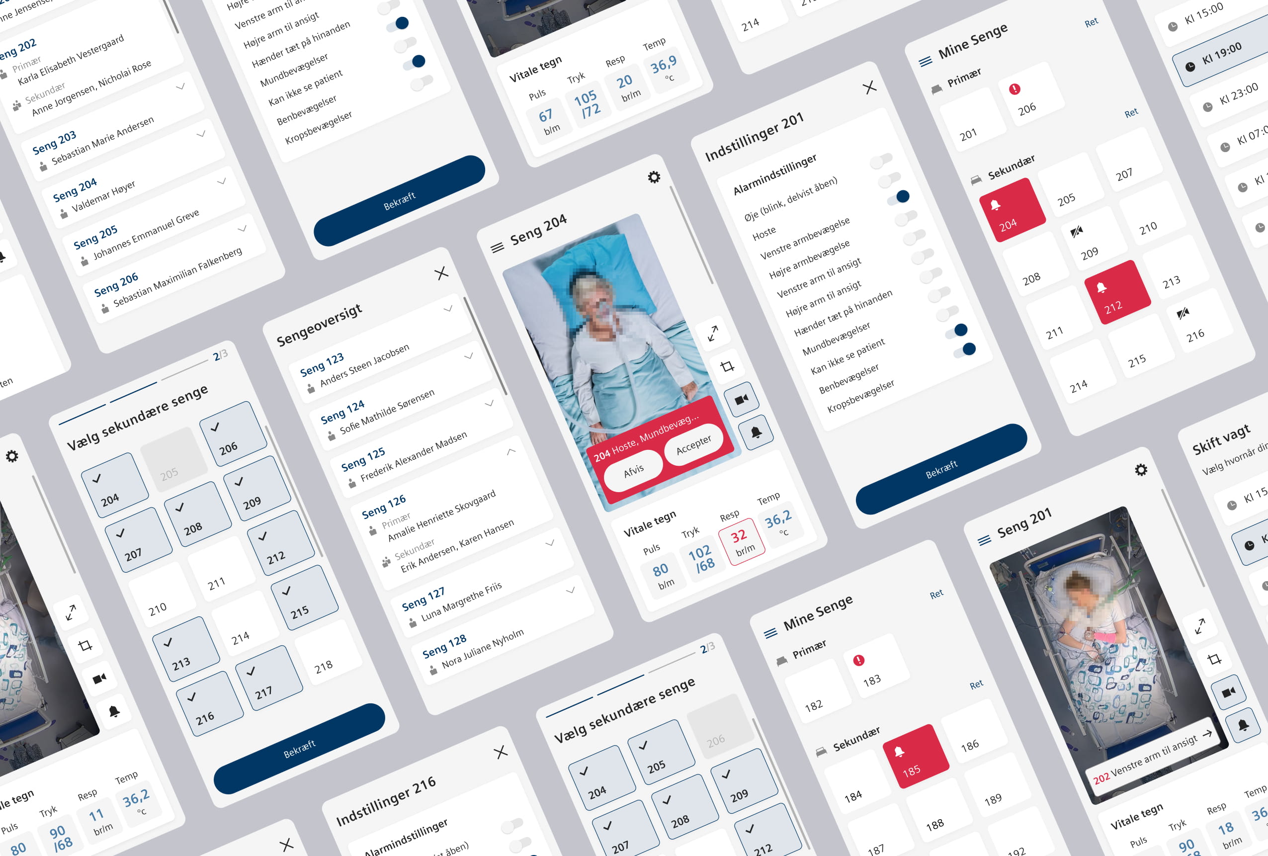
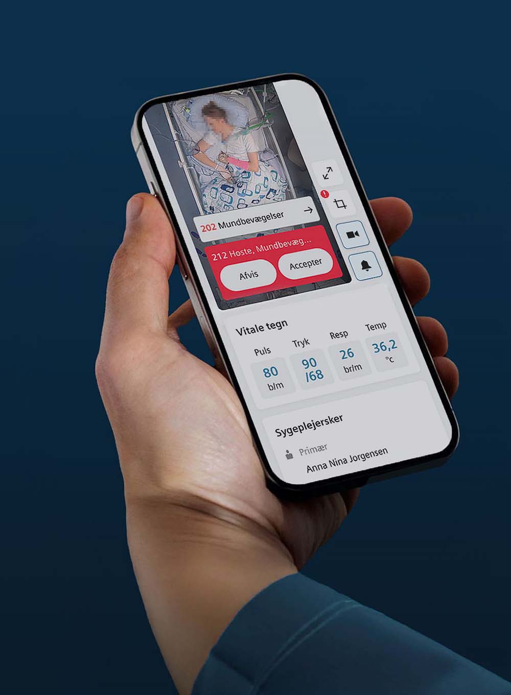
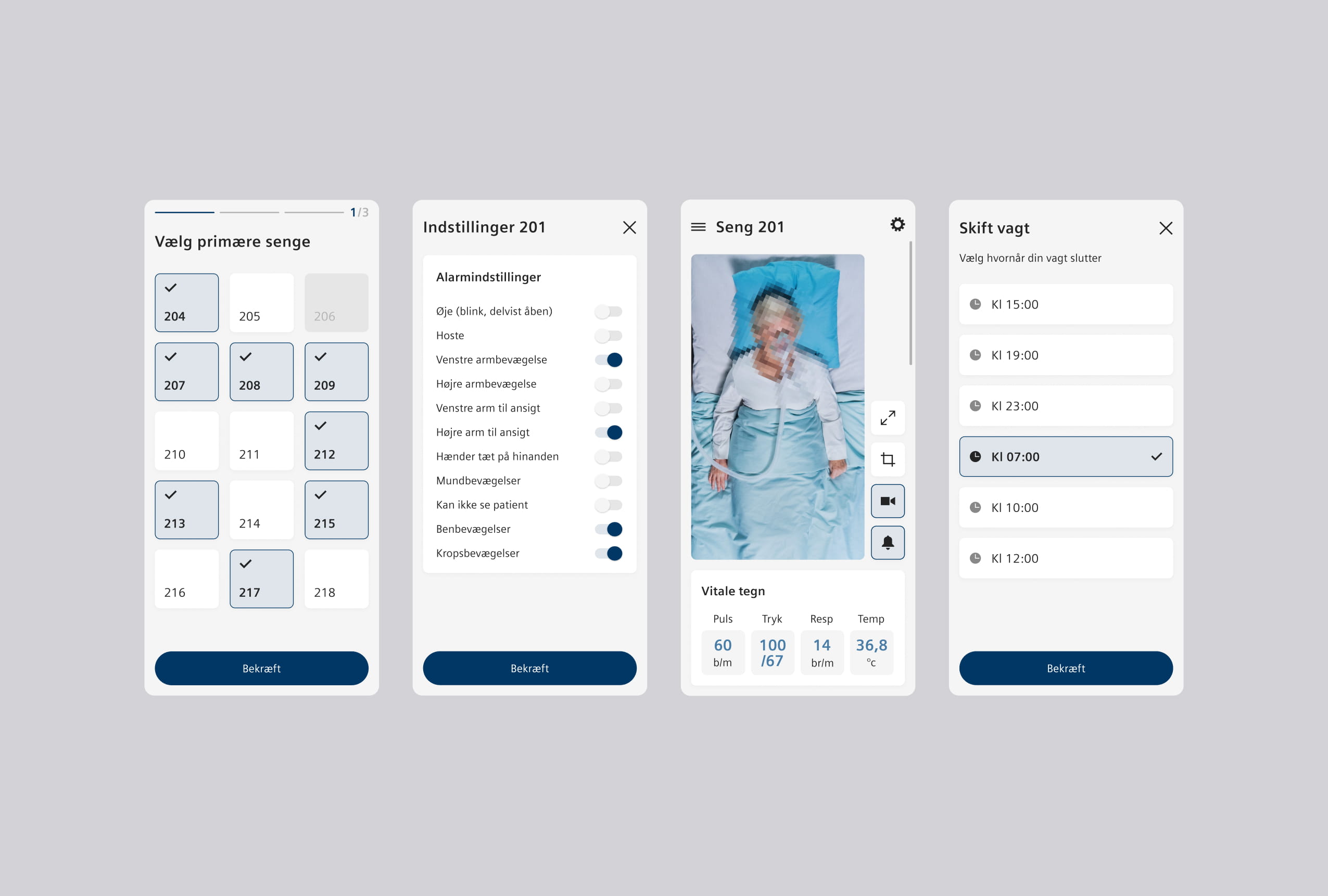
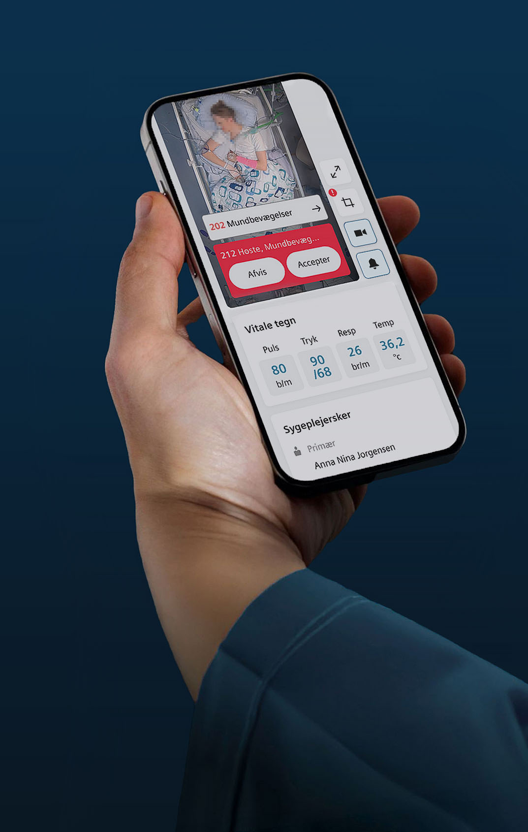
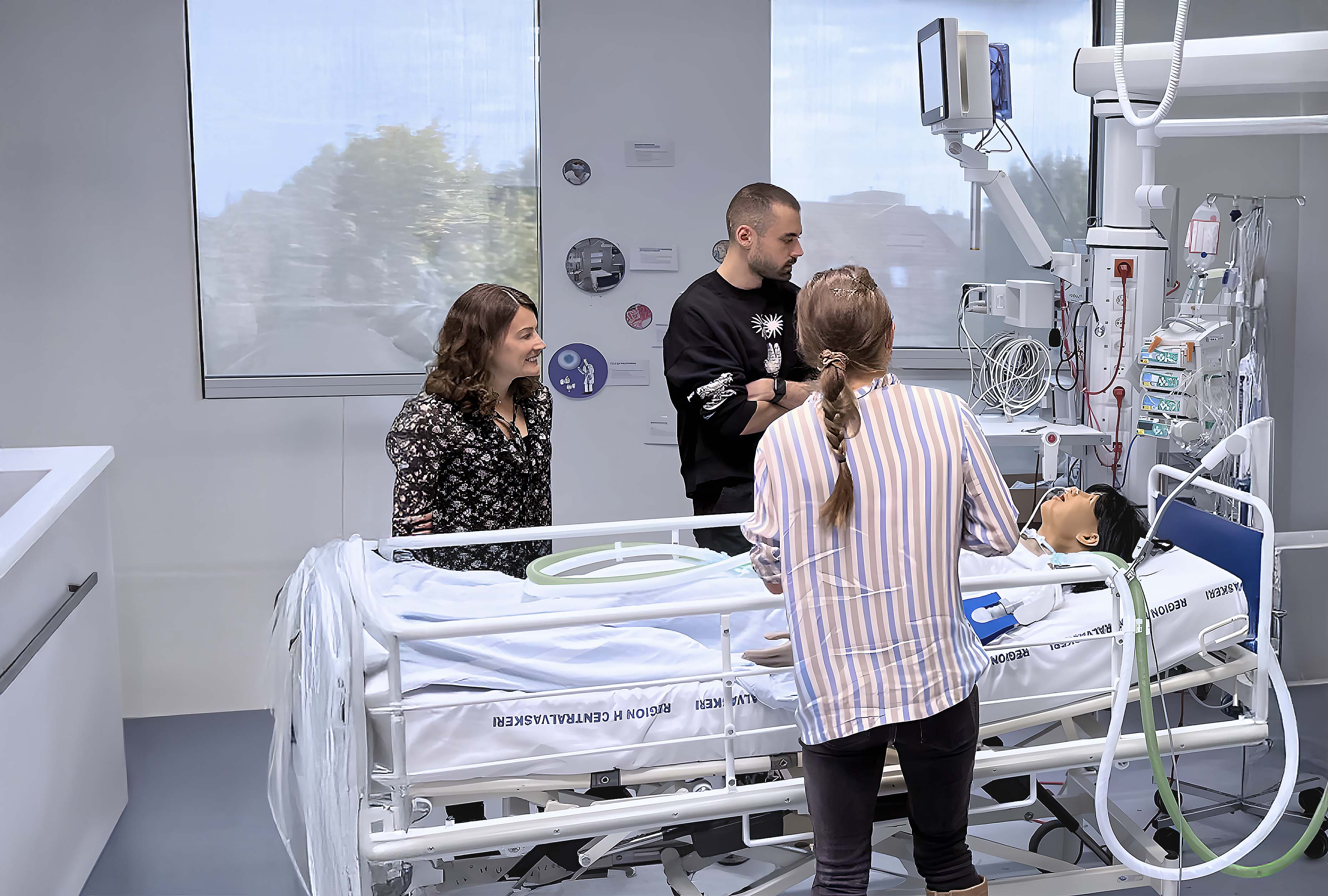
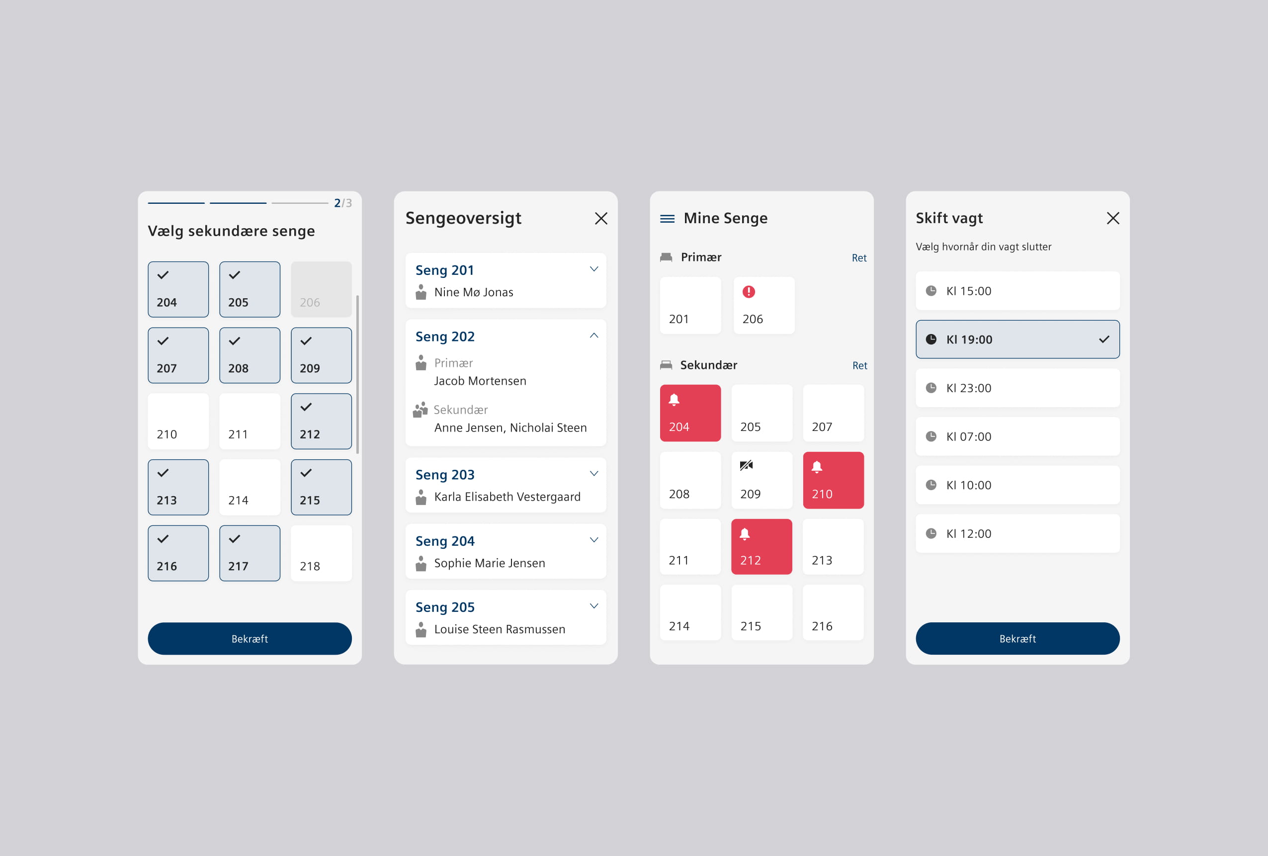
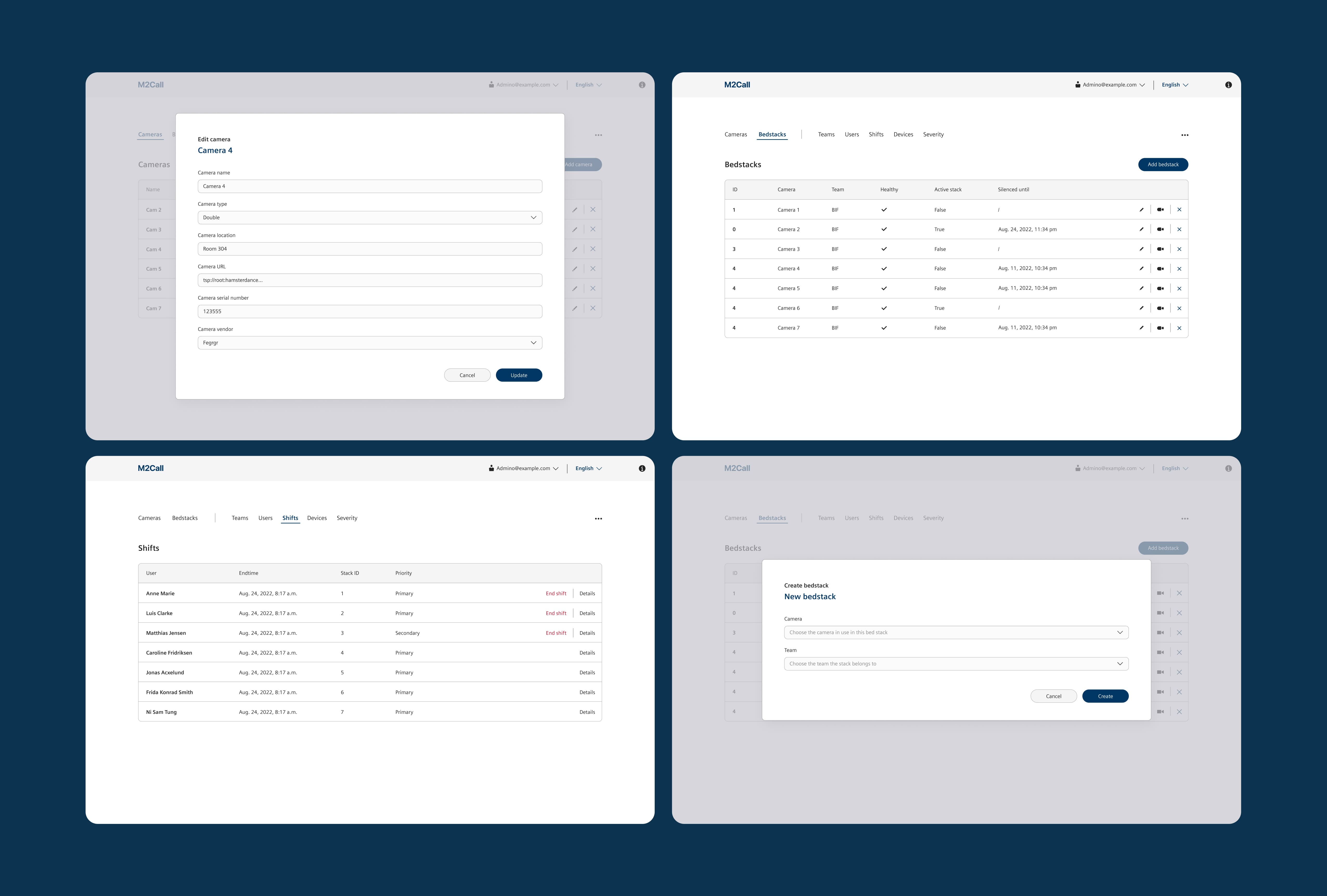
Prototypes, testing and iteration
Early concepts were developed into interactive prototypes and tested with ICU staff. Their feedback helped refine the structure, simplify interactions, and prioritize critical information, resulting in an interface clinicians and nurses could rely on in high-pressure situations.